Mastering Salesforce Administration: Part 2 - Advanced UI Customisation
Published 26/09/2025

This article follows Part 1 — Org Health & Monitoring. There you built habits around security baselines, metadata debt, audit trails, logins, limits, and automation failures. Here the focus shifts outward to what people see and click every day: Lightning apps and navigation, global actions and Home, list views and compact layouts, App Builder templates, Dynamic Forms and Dynamic Actions, visibility rules, related lists, design patterns, performance, accessibility, and where Experience Cloud and OmniStudio fit.
The sections that follow unpack that outline in sequence, deepening from how users navigate the org into App Builder, page assignments, and visibility, then into design patterns, performance, accessibility, and the outer layers where Experience Cloud or OmniStudio apply.
🎨 Advanced UI Customisation
Section titled “🎨 Advanced UI Customisation”The way information is presented in Salesforce shapes how people work. A record page that surfaces the right fields, actions, and related data for the right person, in the right context, removes friction and builds trust in the system. A poorly designed one breeds workarounds, confusion, and eventually, abandonment. UI customisation in Salesforce is not about aesthetics; it is about making the platform work for the people who use it every day.
This chapter explores the tools available to admins for configuring and refining the user experience (UX), from Lightning App Builder and Dynamic Forms to page design patterns and performance. Where topics like Flow and Experience Cloud have dedicated coverage elsewhere in this guide, you’ll find a pointer rather than a repeat.
Why UI Customisation Matters
Section titled “Why UI Customisation Matters”A well‑configured UI helps people do their jobs with clarity and confidence. When the interface reflects real‑world workflows, users can understand a record at a glance, take the right actions without hesitation, and move between tasks without losing context. Good UI design reduces cognitive load by presenting only what is relevant, and by arranging information in a way that feels natural rather than forced.
Salesforce gives you fine‑grained control over what users see based on their role, permissions, and the state of a record. Visibility rules, dynamic components, and tailored layouts allow you to build pages that adapt to the moment. This keeps the interface purposeful and prevents the clutter that often leads to frustration. When users feel the system is working with them rather than against them, adoption follows naturally.
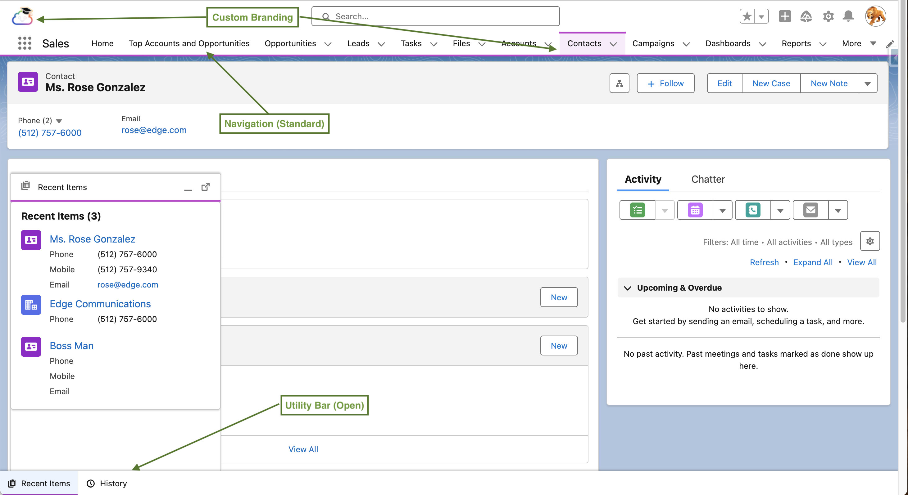
🧭 Navigation & App Structure
Section titled “🧭 Navigation & App Structure”Lightning App overview
Section titled “Lightning App overview”A Lightning App in Salesforce is the container that defines the navigation experience for a group of users. It controls which object tabs and other items appear in the navigation bar, the navigation style (standard or console), the utility bar items, and the app’s branding (logo, colour, and name). Apps are created in the App Manager.
Navigate here: Setup → Quick Find → App Manager
Apps become available to users through profile visibility settings, but in modern Salesforce orgs permission sets and permission set groups are the primary way to grant access. Profiles still determine basic login defaults (such as default app visibility), but permission sets are now the recommended mechanism for exposing apps, features, and object access to specific groups of users without creating new profiles.
Every authenticated user in Lightning Experience operates inside a Lightning App, even if they have never explicitly selected one. The app a user sees depends on which apps are visible to them and the most recently chosen app from the App Launcher. When you create or modify an app, changes are visible to users as soon as you save and assign the app. There is no separate activation step for the app itself; however, Lightning pages (record pages, app pages, home pages) that you add to the app may still require activation in Lightning App Builder before users see them.
App visibility, assignment, and multi‑app strategies
Section titled “App visibility, assignment, and multi‑app strategies”Most organisations use multiple Lightning Apps to tailor navigation for different personas and workflows. A thoughtful app strategy helps keep navigation focused and reduces cognitive load.
Common patterns
Section titled “Common patterns”- Role‑specific apps — e.g., Sales, Service, Support, Operations
- Task‑specific apps — e.g., “Data Quality Console”, “Billing Operations”
- Cross‑functional apps — simplified navigation for users who only need a subset of objects
Users switch between apps via the App Launcher, and Salesforce remembers the most recently used app. This makes multi‑app strategies practical as long as each app has a clear purpose and a focused navigation bar.
How apps are assigned to users
Section titled “How apps are assigned to users”Apps are made available to users in two main ways: profile app visibility and permission set assignments. Profiles define which apps a user can see and which app is their default the first time they log in. Permission sets and permission set groups can then be used to expose additional apps (via the Assigned Apps section) to specific groups of users without changing their profile. This pattern is preferred in modern orgs because it keeps profile sprawl under control while still allowing you to roll out new apps to targeted audiences.
App visibility considerations
Section titled “App visibility considerations”An app appears in the App Launcher only if it is visible to the user’s profile or granted via a permission set, and the user’s license supports the app’s objects. Making an app visible does not override object‑level security; if a user’s profile or permission sets do not grant access to a given object, its tab will not appear in the app’s navigation bar for that user. When you have many apps, keep the launcher focused by restricting specialised apps to the small audiences that need them.
For users who span Sales and Service work, it is often better to assign a focused Sales app and a focused Service Console app, plus a simple cross‑functional Management or Operations app, rather than combining everything into a single all‑purpose app. This keeps each workspace aligned to a clear task while still letting users switch apps quickly from the App Launcher.
Standard Navigation versus Console Navigation
Section titled “Standard Navigation versus Console Navigation”Salesforce offers two navigation models for internal Lightning apps.
Standard navigation
Section titled “Standard navigation”This opens each record in a full page, replacing whatever was previously on screen in that browser tab. It’s the familiar model most users encounter first and works well for straightforward workflows where users move from one record to the next in sequence.
Console navigation
Section titled “Console navigation”Uses a tabbed workspace layout within a single browser window. Workspace tabs represent primary records or work items (for example, a Case or Opportunity), and subtabs open beneath a workspace tab to show related records or supporting information (such as a related Contact, Activity, or Knowledge article). Console navigation preserves context and lets users keep multiple records open at once, making it well suited to high‑volume or multi‑context workflows.
Navigation Items
Section titled “Navigation Items”The navigation items in an app are the tabs that appear in the top navigation bar. These can include
- standard or custom object tabs
- Lightning component tabs
- Visualforce tabs
- External URLs.
The order of items in the navigation bar can be set as the default, but users with the appropriate permission can personalise their navigation bar by reordering items, adding new ones, and removing those they do not use. Admins can prevent personalisation by disabling it at the profile or permission set level if a consistent navigation experience is required.
Utility Bar
Section titled “Utility Bar”The utility bar sits at the bottom of the browser window and provides quick access to tools without navigating away from the current page. Common utility bar items include Recent Items; softphone/CTI integrations; Macros; Notes or Quick Capture; Flow‑launched actions; and Omni‑Channel/work routing. Utility bar items open as a small panel above the bar and close when dismissed, making them ideal for lightweight, recurring tasks that interrupt but do not replace the main workflow.
Themes, Branding, and Custom Logos
Section titled “Themes, Branding, and Custom Logos”Admins can customise the visual branding of internal Lightning Apps with a custom logo and a highlight colour (the colour used in the navigation bar background). These settings are configured per app in App Manager. The logo should be a small image that displays in the top-left corner of the navigation bar when the app is active. The highlight colour affects the top navigation bar background and gives apps a distinct visual identity, which helps users orient themselves when switching between multiple apps.
Branding in Experience Cloud (external facing portals and communities) operates through Experience Builder, an entirely different theming system and is covered in the brief callout at the end of this chapter.
Hands-on
Section titled “Hands-on”If you’d like a gentle, hands‑on way to reinforce the ideas in this section, the Trailhead module Lightning Experience Customization is a great next stop. It walks through the basics of tailoring navigation, apps, and page layouts in Lightning Experience, giving you a safe place to practise the core concepts you’ve just learned here.
🛠 Global actions & publisher layouts
Section titled “🛠 Global actions & publisher layouts ”Global actions and publisher layouts work together to provide a consistent, lightweight action surface across Salesforce. While Lightning Apps define the workspace and navigation, global actions give users quick ways to create or update records without leaving their current page. Publisher layouts determine which of those actions appear for different profiles, ensuring a predictable, organisation‑wide baseline.
Global Actions
Section titled “Global Actions”Global actions give users a fast, lightweight way to create records or capture updates from almost anywhere in Salesforce. They appear in the global actions menu in the Lightning header and on pages that inherit the global publisher layout, including the Home page.
Common global actions include creating new records, logging calls, sending email, launching Flows, or opening custom Lightning or Visualforce components. Because global actions are not tied to a specific record, they do not automatically relate the new record to a parent object. When users need to work in context, for example, creating a Case from an Account then object‑specific actions are the right tool instead.
Global actions reduce navigation overhead and support a more fluid, multi‑tasking workflow, making them ideal for capturing quick notes, follow‑up tasks, or new leads while staying on the current page.
Global Publisher Layouts
Section titled “Global Publisher Layouts”Global publisher layouts control which global actions appear for different profiles. They define the baseline set of actions available across the org and determine what users see in the global actions menu. You configure these layouts in Setup → Global Actions → Publisher Layouts, where you can create one or more layouts and assign them to profiles via Publisher Layout Assignment. A global publisher layout contains only global actions; object‑specific actions continue to live on individual object page layouts. If an object’s page layout does not define its own actions, it can inherit actions from the global publisher layout. This gives you a consistent foundation — for example, “New Task”, “Log a Call”, “Send Email”, and “New Lead” — which you can refine on specific objects where needed.
🏠 Home page configuration
Section titled “🏠 Home page configuration”If global actions provide quick entry points, the Lightning Home page provides the broader context for a user’s day. It is the primary landing surface in Lightning Experience, designed to give each person a clear snapshot of their pipeline, tasks, alerts, and work queues before they open a single record.
Home pages are built and managed in Lightning App Builder, where you choose a standard or custom template to assemble the page using a mix of standard and custom components. Common standard components include Performance (quota or pipeline progress), Assistant (proactive alerts about Leads and Opportunities), Today’s Tasks, Today’s Events, Recent Records, dashboards, and list views, along with custom components that surface work queues or guided workflows. Components such as Actions & Recommendations or embedded Flows can turn the Home page into an action hub, allowing users to respond to insights or launch guided processes without leaving their landing experience.
Home page assignment
Section titled “Home page assignment”Once a Home page is built, it must be activated. Until you activate it, users continue to see the standard Home page or whatever page is currently assigned to them. Activation is where you decide who will use the page. It can be assigned as the org‑wide default, as the default for one or more Lightning Apps, or as a targeted assignment for specific app‑and‑profile combinations.
This assignment model enables clear, persona‑specific landing experiences:
- Sales — a sales‑focused Home page assigned to the Sales app and sales profiles, highlighting pipeline, key deals, and follow‑up tasks.
- Service — a service‑oriented Home page assigned to the Service app, featuring case queues, Omni‑Channel status, and today’s tasks.
- Management — a management‑oriented Home page assigned to an Executive app, emphasising dashboards and cross‑functional metrics.
Salesforce evaluates Home page assignments in order of specificity:
app‑and‑profile → app default → org default.
In multi‑app strategies, this means the same user can see different Home pages depending on which app they’ve opened, while still benefiting from a consistent set of global actions and header navigation. It’s a clean, predictable model that aligns naturally with your broader governance approach of focused apps, focused landing experiences, and minimal cognitive load.
📋 List Views & Compact Layouts
Section titled “📋 List Views & Compact Layouts”List View Usability
Section titled “List View Usability”List views are often the first thing a user sees when they navigate to an object in Salesforce, making them a significant driver of first impressions and day-to-day usability. A well configured list view shows the right columns, in the right order, filtered to the records the user actually needs to see. Admins can create and manage list views for users, and pin a default list view that loads when a user first lands on the object tab.
The Split View option in list views shows the list in a left‑hand panel alongside the record detail in the main area, allowing users to move through a set of records without navigating away. This is particularly effective for high‑volume tasks like triaging cases, reviewing leads, or working through a pipeline.
The Kanban view renders records as cards arranged in columns based on a grouping field (typically a status or stage field) and allows records to be moved between columns by dragging. Kanban views also support an optional chart that visualises a summary metric (for example, the sum of Opportunity Amount) across the columns.
By default, list views open in Table view. This shows records in a spreadsheet‑style grid, with rows for each record and columns for each field, allowing sorting, resizing, and wrapping of column text.
Users can switch between Table, Split View, and Kanban as needed, but admins influence these modes by ensuring the list view filters and columns are configured in a way that makes each view useful.
For a quick look at list views on trailhead have a look at the List Views: Quick Look module.
Compact layouts
Section titled “Compact layouts”A compact layout defines the small set of fields shown when a record appears in a summary context: the hover card that appears when you mouse over a record link, the record card in related lists, the record header in the Salesforce mobile app, and the activity timeline entries. The default compact layout for most objects shows only the record name and a couple of system fields, which provides little context. Configuring a compact layout (via Setup → Object Manager → [Object] → Compact Layouts) with four to six of the most informative fields dramatically improves the usability of related lists and hover previews without requiring any page redesign.
The choice of fields should reflect what a user needs to quickly identify and evaluate a record without opening it. For a Contact, that might be Name, Title, Account Name, and Phone. Keep compact layouts very trim, use no more than six or seven fields. The card format has limited horizontal space, and overloading it undermines the quick‑read, at‑a‑glance benefit.
⚡ Lightning App Builder — Beyond the Basics
Section titled “⚡ Lightning App Builder — Beyond the Basics”Lightning App Builder was introduced in the fundementals section, this section goes beyond the basics and takes a deep dive into the capability.
It is the primary tool for composing the visual layout of pages in Lightning Experience. It is worth being precise about what App Builder controls and what it does not, because this distinction causes confusion for many new admins. Also the answer changes depending on which capabilities you have enabled.
By default, App Builder controls the structure and composition of a Lightning page:
- Which components appear
- Where they sit on the canvas
- How wide each column region is
- Whether a component is shown or hidden for a given user or context.
The content that appears inside several of those components comes from elsewhere. Fields shown in the Record Detail component come from the page layout, configured separately in Object Manager. Actions shown in the Highlights Panel come from the page layout action list. The fields shown in the compact record header come from the compact layout. Each of these is a separate layer of configuration, and App Builder coordinates them rather than replaces them, at least until you start enabling the Dynamic capabilities.
- Dynamic Forms transfers ownership of field layout from the page layout into App Builder, letting you place individual fields and field sections directly on the canvas with conditional visibility.
- Dynamic Actions does the same for the action list, and the
- Dynamic Highlights Panel replaces the compact layout with an admin configurable field panel.
As you enable each of these, the corresponding external configuration becomes less relevant to the Lightning page experience. All three are covered in detail in the sections immediately following this one. For now, the key mental model is this: App Builder is the stage, and the page layout, compact layout, and action list are the defaults that fill it until you choose to take direct control.
Navigate here: Setup → Quick Find → Lightning App Builder
You can also navigate there contextually: from any record page in Lightning Experience, clicking the gear icon and selecting Edit Page opens that record’s assigned Lightning page directly in App Builder. This contextual entry point is the fastest way to make changes to a specific page and is worth bookmarking as a habit.
Page Types
Section titled “Page Types”App Builder supports three page types, and each serves a distinct purpose. Understanding which type you are working with shapes everything else about the configuration.
- Record pages are the most common type. They display a single record from a specific Salesforce object and are what most users spend the majority of their time on. Record pages support the full range of App Builder capabilities: Dynamic Forms, Dynamic Actions, component visibility rules, multi-column templates, tabs, and the Dynamic Highlights Panel.
- App pages serve as custom home screens within a Lightning App. They are the page users land on when they click a tab that does not point to a standard object. App pages use a different set of templates and a simplified component palette. They are useful custom components, dashboards, or operational views that aggregate information from multiple objects in one place.
- Home pages replace the default Salesforce Home tab. They support a selection of components geared toward user productivity and can be assigned to different user profiles to ensure that a sales user and a service agent see a relevant home screen when they log in.
Template Types and Multi-Column Layouts
Section titled “Template Types and Multi-Column Layouts”When you create a new App or Record page, App Builder prompts you to choose a layout template. The template defines header and column regions on the canvas. For record pages, the most commonly used templates are:
- Header and Right Sidebar — a full-width top region (typically used for the highlights panel and path), a wider main column on the left, and a narrower sidebar on the right. This is the default for most standard object record pages and the most versatile starting point.
- Header and Three Regions — a full-width header region and three equal or configurable columns below. Useful for wide screens with dense information needs, though it can feel crowded on smaller displays.
- One Region — a single full-width column. Best suited for simplified record pages where a streamlined experience is the goal, or for mobile first page designs.
- Three Regions — three columns without a dedicated header row. Uncommon for record pages, but useful when you want to distribute component weight more evenly across the canvas.
The template choice is significant because changing it after components have been placed requires repositioning everything manually. For most record pages, the Header and Right Sidebar template is the best default because it mirrors how most users mentally divide record content. The primary working area on the left and contextual or reference data in the narrower right column.
Advanced Template Capabilities: Console Behaviour & Pinned Regions
Section titled “Advanced Template Capabilities: Console Behaviour & Pinned Regions”Lightning record pages use page‑level templates to define the layout regions available on the canvas, while console apps add an additional layer of workspace behaviour such as tabs, subtabs, and split view. These two layers are independent, but they interact in meaningful ways when you design console‑optimised experiences. This is especially evident when agents work across multiple subtabs and need persistent context.
Console‑Optimised Templates and Pinned Regions
Section titled “Console‑Optimised Templates and Pinned Regions”Page templates do more than define columns and header regions, they determine whether advanced layout features such as pinned regions are available. This matters most for console‑style record pages, where users move between workspace tabs and subtabs and need key information to remain visible.
Console versus page templates (scope and responsibility)
Section titled “Console versus page templates (scope and responsibility)”Console behaviour is configured at the app level. It controls workspace tabs, subtabs, split views, and productivity features such as keyboard shortcuts and tab routing. The Lightning page template is separate and page‑scoped: it controls the layout regions that exist on the canvas and whether pinned regions are even an option. Console apps frequently use pinned‑region templates for record pages, but the pinned header or sidebar itself is a page template capability, not an app feature.
Pinned regions — what they are and when to use them
Section titled “Pinned regions — what they are and when to use them”A pinned region is a fixed header or sidebar that remains visible while users scroll the main content or navigate among subtabs on a record. It is ideal for console‑style workflows where agents must keep key fields, a related record, or a guidance panel in constant view while working through a series of interactions. Reserve pinned regions for high‑value, always‑visible content that is frequently needed but costly to hunt for in the main layout.
Pinned‑region templates are desktop‑only and available for specific record‑page layouts. If you need the same page to serve both desktop and mobile users, you may have to compromise and choose a non‑pinned template that supports both form factors, or maintain separate desktop and mobile experiences.
Practical implications for builders and admins
Section titled “Practical implications for builders and admins”Because templates determine whether pinned regions exist at all, decide on your template strategy before you invest heavily in component placement. If you are building for a console app and know agents will work with multiple subtabs open, strongly prefer the pinned‑header or pinned‑sidebar record templates so that essential context stays visible as they navigate. If standard templates do not meet your needs, custom page templates can reproduce pinned‑region behaviour, but doing so requires developer effort and should be reserved for well‑justified use cases.
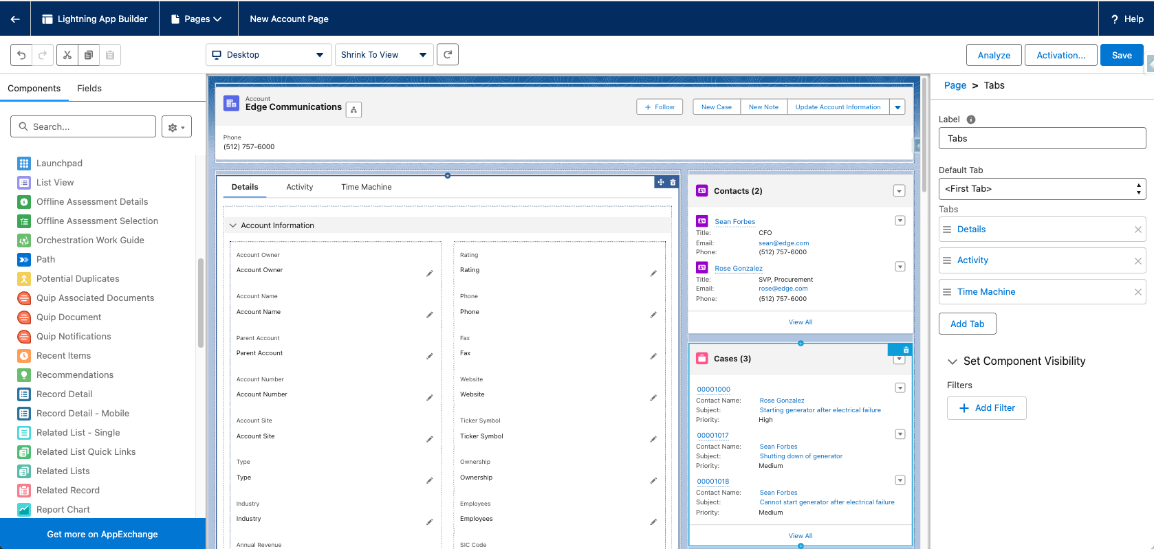
Standard Components
Section titled “Standard Components”App Builder ships with a library of standard components built by Salesforce. Beyond the obvious ones (Record Detail, Related Lists, Activity Timeline, Highlights Panel), several standard components are underused and deserve deliberate consideration during page design.
- The Tabs component organises content into named tabs within a region, allowing users to navigate between groups of related components without scrolling. It is one of the most effective tools for managing information density on a record page. Each tab can contain multiple other components, including nested column layouts, Field Sections (from Dynamic Forms), and related lists.
- The Accordion component provides a similar grouping capability using collapsible sections rather than tabs. These sections expand and collapse individually, allowing users to keep one section open while others remain collapsed. Accordion is well suited to pages where users frequently need only one section at a time and want to reduce visual noise.
- The Path component renders a visual progress indicator that maps a field’s picklist values as stages across a horizontal bar. It is standard on Opportunity and Lead pages but can be configured on any object that has a picklist field you want to use as a stage indicator. Path also supports Key Fields and Guidance for Success. Configurable text and field highlights that appear when the user clicks on a stage, prompting them on what to focus on and what information to capture before moving forward.
- The Dynamic Related List – Single component is a more configurable alternative to the standard Related List component. It allows you to specify which columns are shown, set a default sort order, apply a filter condition to restrict which related records are displayed, and choose which actions are available directly in the component.
- The Flow component allows you to embed an active screen Flow directly on a record page. When a user encounters the component, the Flow launches in context and can pre-populate input variables with values from the current record. This is a powerful way to surface guided workflows inside the record page itself. Flow is covered in depth in Part 3 — Automation.
Tabs, Sub-Tabs, and Page Organisation
Section titled “Tabs, Sub-Tabs, and Page Organisation”Tabs in App Builder are a nesting construct: a Tabs component placed in a column region can contain multiple named tabs, and each tab can contain further components including, if needed, another Tabs component to create sub-tabs. Sub-tabs are useful when a single tab area needs to present two distinct but related views without consuming a full tab slot in the primary navigation. An example: a main tab labelled “Activity & Notes” could contain a sub-tab structure with “Timeline” and “Case Notes” as sub-tabs.
There are practical limits to how deep this nesting should go. Two levels of tabs (top-level and one sub-level) is generally the maximum that users can navigate comfortably before the interface becomes confusing.
The Tabs and Accordion components are also affected by component visibility rules, meaning the entire tab group or accordion section can be conditionally shown or hidden based visibility criteria. This means you can design a record page where a “Billing Details” tab only appears when the Billing Status field has a value, or where an “Escalation Tools” accordion section is visible only to users with a specific permission set.
Page Assignments and the Activation Model
Section titled “Page Assignments and the Activation Model”When you are ready to make a Lightning record page live, click Activation in the App Builder toolbar. The activation modal presents three assignment options, each progressively more targeted.
The Org Default assignment sets the page the default for all users across all apps and record types on that object. This is the broadest assignment works well for simple orgs or for objects where the user audience doesn’t meaningfully vary.
The App Default assigns the page to one or more specific Lightning Apps. Users see this page only when accessing the object through those apps; other apps retain their own assignments. This is ideal when different business units (e.g., Sales vs. Service) use the same object but need different layouts or emphasis.
The App, Record Type, and Profile assignment is the most granular option. You can target a specific combination of app, record type, and profile. This is appropriate when different user segments require meaningfully different page designs. For example, Sales reps in the Sales App may need a very different Account page from Service agents in the Service App. Salesforce evaluates all three dimensions together to determine which page a user should see.
The Relationship Between Record Pages, Page Layouts, and Record Types
Section titled “The Relationship Between Record Pages, Page Layouts, and Record Types”Three distinct configuration layers interact when a user opens a record in Lightning Experience. Confusing these layers is one of the most common pitfalls in Lightning administration.
Record types
Section titled “Record types”Record types serve two main purposes:
- They control which picklist values are available when creating or editing a record
- They act as one of the dimensions used in Lightning page assignment (alongside app and profile).
Record types do not define a page layout or a Lightning page by themselves. Instead, it acts as a dimension you can use to vary both.
Page Layouts
Section titled “Page Layouts”Page layouts define:
- The fields displayed inside the Record Detail component when Dynamic Forms is not enabled
- The related lists displayed unless overridden by individual Related List components
- and the fields and actions available in certain classic and mobile contexts.
Page layouts are assigned to record type + profile combinations in the standard page layout assignment matrix, a separate step from Lightning page assignment.
Lightning record pages
Section titled “Lightning record pages”Lightning record pages define the overall structure of the page. Which components appear, where, and who sees them. When Dynamic Forms is enabled, field layout is managed in App Builder and the page layout’s field arrangement is no longer used for the desktop record page.
The practical implication is that these two systems are nested rather than merged. The Lightning page controls the structure e.g. which components appear and where. The page layout feeds the content of specific components within that structure, most notably the Record Detail component. When Dynamic Forms is enabled on a page, field layout moves out of the page layout and onto the lightning layout directly, so changes to the page layout’s field arrangement will no longer affect what users see on that record page. When Dynamic Forms is not enabled, the Record Detail component still reads from the page layout, so both systems are actively in play.
Previewing and Testing Before Activation
Section titled “Previewing and Testing Before Activation”App Builder includes a View As feature that lets you preview the page as a specific user without logging out of your admin account. Access it from the user icon in the App Builder toolbar or from the activation screen. You select a user in your org, and the canvas updates to show you exactly what that user would see, including which components are visible, which fields are present, and which actions are available, based on their profile, permission sets, and any field values on the current record (if previewing from a live record via the gear icon → Edit Page route).
Trailhead recommendation
Section titled “Trailhead recommendation”If you want to reinforce the concepts in this section, the Trailhead module Lightning App Builder is an excellent companion. It walks you through the practical steps of creating and editing Lightning pages, placing components, and working with templates.
✨ The Highlights Panel
Section titled “✨ The Highlights Panel”The highlights area sits at the top of a record page and is the first thing a user sees when they open a record. It displays a small set of key fields alongside the available actions, making it prime real estate for the information a user needs to orient themselves quickly.
In the standard Highlights Panel, the fields displayed are driven by the object’s compact layout, configured separately in Object Manager. Compact layouts have a hard limit of ten fields and apply uniformly to all users regardless of their role, profile, or the state of the record. The actions shown alongside those fields come from the page layout’s action list. Both of these configurations are object wide and there is no way to vary what one user sees versus another, or to show different fields when a record is in a particular stage.
The Dynamic Highlights Panel, introduced in Spring ‘25, removes those constraints by bringing the highlights area under direct App Builder control. You will find it on the Fields tab in the App Builder component palette. Once placed, it supports up to 12 fields, a configurable Primary Field (which defaults to the object’s Name field), and visibility rules on individual fields based on field values, record type, profile, or assigned permission sets. It also incorporates Dynamic Actions by default, meaning the displayed fields and available actions are both managed from a single place in App Builder rather than across two separate configuration screens. The visibility rules model used here is the same one that applies throughout App Builder and is covered in full in the Dynamic Forms and Visibility Rules sections below.
For any new record page build, or any existing page you are significantly revising, the Dynamic Highlights Panel is the recommended starting point. The standard Highlights Panel remains available for simpler use cases or for objects where the compact layout arrangement is already working well and no per-user or per-context variation is needed.
📐 Dynamic Forms
Section titled “📐 Dynamic Forms”Dynamic Forms lets admins place fields and sections directly on Lightning pages and show or hide them with visibility rules, reducing page‑layout sprawl, improving user focus, and simplifying Maintenance.
Traditional record pages display fields through a Record Detail component that reads its configuration from the page layout. The limitation is that the page layout is edited in a separate screen, applies a single field arrangement to all users assigned to that layout, and has no capacity for conditional visibility at the field level. Dynamic Forms changes this by letting you place individual Field and Field Section components directly onto the Lightning record page, replacing the Record Detail component entirely.
Field and Section Visibility Rules
Section titled “Field and Section Visibility Rules”The real power of Dynamic Forms lies with Conditional Visibility. Each field and each field section can have one or more visibility conditions applied. These conditions can reference field values on the record (for example, show this section only when Status = Closed), the record type, the current user’s profile, or a permission sets. Conditions can be combined with AND/OR logic, giving you fine grained control over what appears on screen without writing a single line of code.
A practical example: on an Opportunity record, a section titled “Closed Deal Details” containing fields like Close Reason, Actual Contract Value, and Key Decision Maker could be hidden until the Stage field equals Closed Won or Closed Lost.
Why this matters
- Cleaner pages reduce cognitive load and speed data entry.
- Role‑aware UIs let you show sensitive fields only to authorized users.
- Device targeting lets you tailor desktop and mobile experiences from the same page.
- Faster changes because field placement and visibility are managed in App Builder.
Keep visibility rules readable and documented. Use clear names for sections and rules so future admins can understand the intent.
When to Use Dynamic Forms versus Page Layouts
Section titled “When to Use Dynamic Forms versus Page Layouts”Dynamic Forms are not yet available for every standard object and not supported on pages built with pinned regions or custom templates. For objects where Dynamic Forms are available, the general guidance is to use them when:
- You need field-level conditional visibility
- Where you want to manage field layout and page structure in a single place
- Where you have multiple audience segments that need meaningfully different field arrangements.
Page layouts still serve a role: they continue to control the fields shown in the related list quick view, the fields shown when creating a record via a quick action modal (unless the action has its own page layout override), and the actions available in certain classic interfaces. The two systems are complementary rather than mutually exclusive, you will often use both within the same org.
Trailhead has the Quick Start: Dynamic Forms module for a complementary read.
🎬 Dynamic Actions
Section titled “🎬 Dynamic Actions”Dynamic Actions let you control which actions appear in the highlights area directly from Lightning App Builder, with per‑action visibility rules so a single record page can present different action sets to different users and contexts. This improves usability by surfacing only the actions that matter, reduces reliance on multiple page layouts, and keeps the action bar focused on the tasks a user actually performs on that record.
Before Dynamic Actions, the actions in the Highlights Panel were fixed by the page layout; every user assigned to that layout saw the same buttons, in the same order, regardless of their role or the state of the record. Upgrading a page to use Dynamic Actions moves action management into Lightning App Builder, so you can add, remove, reorder, and target actions from the page canvas without editing page layouts or deploying metadata. This lets you adapt the action bar to the audience, process stage, and device while keeping a single record page assignment where possible.
Visibility Filters
Section titled “Visibility Filters”Dynamic Actions’ power comes from per‑action visibility rules. Each action can be shown or hidden based on:
- Record field values
- Record type
- User profile or permission set
- Device type (desktop vs mobile)
Conditions support AND/OR logic and multiple criteria per action, enabling precise, declarative targeting without code.
This means you can design a record page for scenarios like:
- A sales rep sees Create Quote and Send Email actions
- A manager sees Approve Discount and Reassign Owner actions
- A read-only user sees none of these actions
All from the same record page, with no custom code.
👁️ Visibility Rules & Component Visibility
Section titled “👁️ Visibility Rules & Component Visibility”In the previous sections we have introduced the application of visibility rules to fields (Dynamic Forms) and actions (Dynamic Actions). The same rules engine also applies to any component you place on a Lightning record page. Related Lists, Charts, custom Lightning components, Flow components, Rich Text blocks, even entire Tabs containers can all have their own visibility conditions.
These rules use the same inputs as before:
- Record field values
- Record type
- User profile or permission set
- Device type (desktop vs mobile)
allowing you to shape the entire page around the user and the context of the record.
This effectively turns a single Lightning record page into a multi‑audience experience. A Case page might show an SLA Tracking component only to users with a Service Manager permission set, display a Knowledge Sidebar only when the record type is Technical Support, and hide a complex related list on mobile where screen space is limited. None of this requires separate page assignments or developer involvement.
Building Context-Aware, Role-Appropriate Pages
Section titled “Building Context-Aware, Role-Appropriate Pages”The practical consequence of component‑level visibility is that you can invest in building one well‑designed record page per object (or at least a minimal set) instead of maintaining a growing collection of near‑duplicate pages. This reduces maintenance overhead and ensures that structural improvements benefit all users at once.
A good design discipline is to define your audience segments before you start building. Ask:
- who uses this record?
- what do they need to see?
- what actions do they take?
- what context changes their needs?
Map those answers to Salesforce concepts and configure visibility rules accordingly. Visibility rules work best when they reflect real business logic rather than a series of one‑off customisation requests applied without a coherent plan.
🔗 Related lists
Section titled “🔗 Related lists”Related lists are interactive components you place on a record page to surface the work that surrounds a record such as Cases on an Account or Activities on an Opportunity. They’re there because most Salesforce records don’t stand alone, related lists exist because a single record rarely tells the whole story. They turn the record page into a working surface: users can review items, take actions (create, edit, run mass actions), without leaving the record, which reduces navigation and keeps context intact.
There are three primary related‑list components you’ll use in App Builder:
- Related Lists - Show all related lists defined on the page layout
- Related List – Single - Show records from one specific relationship from the page layout.
- Dynamic Related List – Single - This one is configurable from App Builder and displays a filtered slice of a relationship.
The dynamic variant is especially useful when you need persona‑specific slices of work without changing page layouts or creating extra list views.
Related Lists (the page‑layout driven component)
Section titled “Related Lists (the page‑layout driven component)”The classic related‑lists area rendered as a single App Builder component. It displays the set of related lists defined on the object’s page layout and mirrors the behaviour users saw in Classic. In App Builder you place the component and can rename its label, but you don’t pick fields or filters there. Use this when you want consistency across many pages and prefer a single source of truth for related‑list columns and actions. It’s the fastest way to preserve existing behaviour when migrating from Classic.
Related List – Single
Section titled “Related List – Single”A focused component that places one specific relationship (for example, Opportunities on an Account) into a chosen region of the Lightning page. You add the component in App Builder, select the relationship, and and the list style (basic, enhabced etc.). Basic lists are lightweight and fast (few columns); enhanced lists show more fields, sortable columns, and mass actions and are best for decision‑critical lists in the main region. The columns and actions the list displays are taken from the object’s page layout. It can be used to highlight a single, layout‑driven relationship in a particular spot while keeping column and action control centralized in the page layout.
Dynamic Related List – Single
Section titled “Dynamic Related List – Single”This component lets you place a filtered, configurable slice of a relationship directly on a record page (for example, Opportunities on an Account). Add it by dragging Dynamic Related List – Single onto the canvas and selecting the target relationship, or by upgrading an existing Related List – Single with Upgrade Now to migrate it into a dynamic list.
You configure Dynamic Related List – Single entirely in the App Builder properties pane: choose the display style (table‑style list or tiles), pick and order fields, set the number of records to display, and define the sort field and order. You can also add filters to narrow which records appear, control which actions are available (New, Edit, Delete, mass actions), and give the component a clear label so users understand the filter logic.
Use dynamic lists when you need targeted, role‑aware views or multiple slices of the same relationship on one page (for example, My Open Cases, High‑Priority Cases, Recently Closed). They are ideal for reducing navigation because users can work from a single record page rather than bouncing between related list views.
From a performance perspective, you can filter and cap rows at the page level without changing page layouts. Keep lists focused by filtering aggressively, placing action‑heavy, column‑rich lists in the main region. Use lighter lists in sidebars, and avoid loading too many data‑heavy lists on a single page.
Use App Builder’s Analyze tool to see which related lists contribute most to page loading time. Where you find low‑value or rarely used lists, consolidate them or move them behind View All so they do not slow down the default record view.
For a complementary read, take a look at the Upgrade to Dynamic Related Lists trailhead module.
🎛 Custom Buttons, Quick Actions & Overrides
Section titled “🎛 Custom Buttons, Quick Actions & Overrides”Global versus Object Specific Actions
Section titled “Global versus Object Specific Actions”Salesforce distinguishes two action types, global actions , which are created once and available across supported pages (Home, record pages, Lightning apps, mobile) and object‑specific actions, which exist only in the context of a particular object’s records. This section assumes you already know how to create global actions and focuses on how global and object‑specific actions behave on record pages and in lists.
Global actions
Section titled “Global actions”Are created once and can be added to any page that supports actions, such as the Home page, record pages, and custom Lightning app pages. They are not tied to any object and are typically used for cross‑context tasks such as creating a record, logging a call, or sending an email. In Lightning Experience users access them from the global actions menu in the header, the Action bar, or equivalent mobile/utility placements. Global actions are covered in the Global Actions & Publisher Layouts section; here we treat them as a known building block and explain how they interact with object‑specific actions on record pages.
Object‑specific actions
Section titled “Object‑specific actions”Are created on a specific object and are available only in the context of that object’s records.
Navigate to: Setup → Object Manager → Object → Buttons, Links, and Actions
They can create related records pre‑populated with values from the source record, update fields on the record, launch a Flow with record context, or call a custom Lightning component. These actions are surfaced on the record page layout (or via the Lightning Record Page’s Dynamic Actions panel) and inherit object‑level security and page‑layout visibility rules.
When you create a quick action, you define its type, the fields shown in the action modal (if applicable), and any predefined field values. Predefined values are especially useful for creation actions: a New Case quick action on a Contact record can pre‑populate the Account and Contact lookups from the source record, saving the user from manual entry and reducing data‑quality errors.
Custom buttons and page overrides
Section titled “Custom buttons and page overrides”Custom buttons can be placed on record pages or in list‑view actions in several ways. List buttons appear in the list view button bar for an object and can run actions on the selected records, such as redirecting to a URL, launching a Visualforce page, or opening a custom Lightning component. Detail page buttons appear on the record detail and can similarly invoke a URL, Visualforce page, or Lightning component, often pre‑populating parameter values from the record or opening an external resource. In most modern Lightning implementations, custom buttons are used sparingly, with the majority of workflow actions handled instead by quick actions and Flow‑launched actions, which integrate more cleanly with Lightning page layouts and Dynamic Actions.
Page overrides allow you to replace the standard behaviour for core record actions—such as View, New, Edit, and Delete—with a custom Visualforce page or Lightning component. They are configured via Setup → Object Manager → [Object] → Buttons, Links, and Actions → Standard Buttons and Links, where you specify which page or component should be used for each standard action in each user experience (Classic, Lightning Experience, mobile). Overrides are powerful when the standard pages cannot meet complex business‑process or UX requirements, but they carry a maintenance overhead because they must be updated whenever the underlying standard behaviour changes or if you later move to different component models such as Experience Builder sites. For this reason, use page overrides only when configuration alone would not be sufficient, and where you can accept the long‑term implementation and governance cost.
Interaction with Dynamic Actions
Section titled “Interaction with Dynamic Actions”When you upgrade a page’s Highlights Panel to Dynamic Actions, the App Builder action list takes precedence over the page‑layout action list for that page. Any custom buttons or quick actions you have configured on the page layout will no longer automatically appear on that record page. You need to add them explicitly in the Dynamic Actions panel in App Builder and apply any desired visibility rules. Because this is effectively a one‑way change for that page, review the page‑layout action set before upgrading to ensure no required actions are lost.
📑 Record Page Design Patterns
Section titled “📑 Record Page Design Patterns”Record page design patterns are not about making every page identical; they create consistent ways of working with records across the org. When layouts follow predictable patterns for the same user role or workflow, people move between objects without relearning the interface, and admins can apply changes and governance more predictably at scale.
TThis section explains why consistency matters, what makes a layout effective for a specific job, and how to identify high‑impact versus occasional‑reference elements.
Why consistent layouts matter
Section titled “Why consistent layouts matter”Consistency lets users focus on the data, not the interface. When the structure is familiar across objects, users spend less time asking “Where is that?” and more time completing tasks. That reduces training time, lowers error rates, and speeds onboarding.
For admins, consistent patterns make change simpler. If Case, Account, and Opportunity follow the same logic for primary fields, actions, and related work, you can reason about a change once and apply it broadly instead of treating each page as a special case.
Consistency does not mean identical, different personas may need different patterns, but the internal logic should be recognisable across patterns.
What makes a good layout
Section titled “What makes a good layout”A good record page is designed for a clear purpose and answers three questions at a glance:
- What is the current state of this record?
- What are the next steps?
- What context do I need to decide?
If those questions are answered quickly, the page is doing its job.
Good layouts share a few practical traits:
Clear hierarchy.
Section titled “Clear hierarchy.”Primary fields and actions occupy the most prominent area. Secondary details and metadata live in lower‑priority regions. Users should not need to scroll to find the information that drives the core workflow.
Scannability.
Section titled “Scannability.”Fields are grouped into logical sections with predictable labels so users can pattern‑match instead of reading every field.
Action orientation.
Section titled “Action orientation.”The most important actions sit near the relevant data rather than buried in a generic action bar. This keeps the user’s focus on the task.
Performance awareness.
Section titled “Performance awareness.”Heavy components are minimised or moved behind View All links so the page loads quickly and avoids time‑to‑interactive cliffs.
A layout that looks tidy but forces users to hunt for critical information is not effective. Litmus test: can a target‑persona user complete their core job in 10 seconds without training? If not, the layout favours aesthetics over usability.
Above the Fold
Section titled “Above the Fold”The most important real estate on any record page is what the user sees before they scroll. On desktop, this is roughly the highlights panel at the top, the first column of components, and the beginning of any tabs or related lists in the secondary section. Everything placed in this area should be there because the user refers to it frequently, components that require occasional access belong in tabs or further down. Components that are rarely needed at all should be questioned.
The term “above the fold” comes from newspaper design, where the most important stories appeared on the visible half of the front page when the paper was folded. The same idea applies here: users form quick impressions of whether a system is useful based on whether the information they need is immediately visible. If they have to scroll to find the record status, the assigned user, or the most recent case note, the UI is creating friction, even if all the information is technically present.
Information Density and Tabs
Section titled “Information Density and Tabs”More fields are not always better. A common failure is treating the record page as a data dump because “users might need it.” A record page that shows fifty fields in a single scrolling column forces users to hunt through noise to find information. The better approach is to design for the 80% use case and make the remaining 20% accessible but not dominant.
Tabs solve this problem by organising information into named groups that users can navigate deliberately. Each tab has a clear purpose, and a user who wants the phone number does not have to scroll past the billing address, the campaign history, and the industry classification to find it.
Sub‑tabs (tabs inside a region) are useful when a single tab must host two related but distinct panels without adding top‑level tabs.
Using the correct design components and assessing with the performance analysis tools covered at the end of this chapter ensures that your design choices translate to a fast, usable page.
Designing for Desktop and Mobile
Section titled “Designing for Desktop and Mobile”Desktop and mobile users have different needs. Desktop supports denser layouts and deeper work; mobile is for quick checks and simple updates. The Salesforce mobile app renders the same components in a single column, so use device visibility rules to keep the mobile view lean: show only components that serve mobile tasks and avoid wide tables or complex charts.
As a general rule, keep the mobile visible component set lean. Limit components to those that genuinely serve a mobile use case, ensure fields in the highlights panel are the ones most often checked on the go, and avoid placing wide tables or complex charts in positions where they will render poorly on a small screen.
Patterns for Different Object Types
Section titled “Patterns for Different Object Types”Different objects need different patterns. Reference objects (Accounts, Contacts) prioritise key attributes and navigation to related records. Process objects (Opportunities, Cases) prioritise progress indicators like Path, they enable quick inline edits, and next actions.
Custom objects created to support a specific business process need pages designed around their process, the field order should reflect the order in which information becomes known, not the order it was added to the object.
🔧 Custom Lightning Components — An Admin View
Section titled “🔧 Custom Lightning Components — An Admin View”What LWC and Aura Components Are
Section titled “What LWC and Aura Components Are”Lightning Web Components (LWC) and Aura are the two frameworks developers use to build custom UI elements for Salesforce. From an admin’s perspective, the distinction between them matters less than what they make possible. Each enables developers to build, package, and deploy components that extend or replace standard UI behaviour. Once deployed, a custom component appears in the App Builder palette. Admins can drag it onto pages, configure any exposed properties, and apply visibility rules; some components expose admin‑configurable properties, while others require developer changes to alter behaviour.
LWC is the newer and recommended framework; it is faster, built on web standards, and better supported by Salesforce’s ongoing investment. Aura is the older framework and is still widely used, particularly in AppExchange packages built before LWC was introduced. Admins will encounter both; they appear similarly in App Builder, but whether a component is configurable without code dependson how the developer implemented its properties.
When a custom component is needed
Section titled “When a custom component is needed”Request or acquire custom components only when standard components, Flow, or configuration cannot meet the requirement. Common cases include complex data visualisations that go beyond the standard chart options, integrations with external systems that need to render live data on a page, specialised input forms that guide users through a structured workflow, and components that enforce business rules in real time as users interact with a form.
Before requesting a bespoke component, it is worth checking AppExchange first. A large catalogue of pre‑built components exists covering common use cases, some are free some are paid. Installation and configuration still require admin or developer work, but this is usually faster and lower risk than commissioning a bespoke build.
Working with custom components in practice
Section titled “Working with custom components in practice”When you are working with a developer to build or maintain a custom component, asking a few practical questions will help you make informed decisions and avoid common pitfalls. For example, does the component support admin‑configurable properties in App Builder, or does it require code changes to alter its behaviour? Has it been tested across the relevant record types, profiles, and devices? Does it make external API callouts, and if so, what is the impact on page load time? Is it accessible and WCAG‑compliant, and who is responsible for maintaining it when Salesforce releases updates that affect its underlying dependencies?
These questions are practical: they help ensure the component is maintainable, performant, and safe to run in production. If a component requires frequent developer changes to remain functional, it becomes a long‑term liability.
Take the Trailhead module Lightning Web Components Basics if you’re an admin who wants practical, non‑developer fluency about what LWC can do and when to ask for one; it’s short, hands‑on, and focused on the essentials.
🧪 OmniStudio
Section titled “🧪 OmniStudio”OmniStudio is a Salesforce product originally developed for Industry Clouds (like Health Cloud, Financial Services Cloud, and Communications Cloud) that provides a set of low‑code tools for building rich, guided user experiences beyond what the standard Lightning component library supports.
As an admin, you may encounter OmniStudio components—such as FlexCards or OmniScripts embedded in Lightning pages, tabs, or flows, even if you are not the primary builder for these experiences. Understanding that they exist and where they tend to live is enough for most governance and support tasks; you do not need to become a full‑time OmniStudio designer.
Its three core UI tools are:
- FlexCards – Configurable card‑based UI components that display contextual data and actions from multiple data sources.
- OmniScripts – Step‑by‑step guided interaction flows for complex processes.
- Document Generation – Capabilities for producing formatted output documents.
If your org is licensed for an Industry Cloud or you notice OmniStudio components in your environment, it is worth exploring Trailhead’s OmniStudio modules to understand the configuration model. OmniStudio has its own designer tools, data source model, and activation steps that differ from the standard App Builder workflow, and it represents a significant capability investment when fully adopted.
📊 UI Performance & Testing
Section titled “📊 UI Performance & Testing”Lightning Page Performance Analysis
Section titled “Lightning Page Performance Analysis”App Builder includes a built-in performance analysis tool that every admin should run before activating a new or significantly revised Lightning record page. To access it, open the page in App Builder and click the Analyze button in the top toolbar. The tool evaluates the components on the page, the number of related lists, field volume, and the metadata configuration, then returns a set of recommendations grouped by category. It estimates page load time for desktop and mobile separately, flags components that contribute disproportionately to load time, and highlights issues like duplicate related list instances, excessive field counts, and components with known performance implications.
The results are advisory rather than prescriptive. A flagged component is not automatically a problem, but it is one you should evaluate consciously. A page that scores poorly may still be acceptable if the slow component is essential and users understand the trade‑off. The real value of the analysis is that it gives you concrete data to support simplification discussions and surfaces issues that would otherwise remain invisible until users report slowness.
Minimising Components and Automation Impact
Section titled “Minimising Components and Automation Impact”Every component on a Lightning record page adds work for the browser. Related lists are often the heaviest contributors because each one executes a query. A page with many individual related list components will load more slowly than one that uses the consolidated Related Lists (tabbed) component to show the same information. Where possible, prefer the tabbed component over multiple standalone related lists.
Automation also affects perceived performance. Record‑triggered Flows, triggers, and validation rules all execute when a record is opened or edited, and a slow page may be suffering from automation overhead rather than UI complexity. The Lightning Usage App (Setup → Quick Find → Lightning Usage) provides org‑wide performance data, showing which pages are slowest and which users experience the longest load times. A useful complement to per‑page analysis.
Testing Across Configurations
Section titled “Testing Across Configurations”A record page that works perfectly for one user may behave differently for another. Before activation, test the page across the key combinations of record type, profile, and permission set that will encounter it. Pay particular attention to visibility rules: if a component should appear only for users with a specific permission set, verify the behaviour by previewing as a user who lacks that permission. Test on mobile as well as desktop; the mobile preview in App Builder is helpful, but validating on an actual device or in the Salesforce mobile app is more reliable.
🌍 Accessibility & Internationalization
Section titled “🌍 Accessibility & Internationalization”Accessibility and internationalization make your record pages usable for everyone, regardless of ability, device, or language. As an admin, you don’t need to know how to code accessible components, but you do need to recognise what good accessibility looks like and how to test for it. Aim for WCAG (Web Content Accessibility Guidelines) Level AA as a baseline and design with the locales you support in mind. E.g. date, number, and currency formats.
Making components accessible
Section titled “Making components accessible”Most standard Salesforce components already follow accessibility best practices. Your role is to ensure the page uses them sensibly: avoid hiding essential information behind hover‑only interactions, keep labels clear, and make sure any custom components you install expose proper labels and help text. If a component uses ARIA (Accessible Rich Internet Applications) attributes behind the scenes, that’s handled by the developer but we should still confirm it behaves correctly for users.
Keyboard navigation
Section titled “Keyboard navigation”Every action on a record page should be usable with a keyboard alone. A quick “Tab test” is often enough: tab through the page, open dialogs, move between fields, and check that focus is always visible and moves in a logical order. If you get stuck, lose focus, or can’t activate something without a mouse, that’s a red flag.
Screen‑reader basics
Section titled “Screen‑reader basics”You don’t need deep screen‑reader expertise, but you should run a simple smoke test using a built‑in tool like VoiceOver on macOS/iOS or Narrator on Windows. Check that headings are announced, fields have meaningful labels, and error messages are read out. If a custom component is silent or confusing, raise it with the developer or vendor.
Localizing labels and help text
Section titled “Localizing labels and help text”Internationalization is about more than translation. Make sure labels, help text, and examples make sense for your users’ locale. Check that dates, numbers, and currencies follow the right format, and that translated text doesn’t overflow or break layouts. Look for text inside images as it can’t be translated and isn’t accessible to screen readers.
🌐 Experience Cloud
Section titled “🌐 Experience Cloud”Experience Cloud sites use their own UI layer, built on either Lightning Web Runtime (LWR) or the older Aura‑based runtime, and are configured in Experience Builder rather than Lightning App Builder. The component palette, theming model, page templates, and navigation structure all differ from internal Lightning apps. Branding is handled through Experience Builder’s Theme panel, which controls colours, fonts, spacing, and any custom CSS. Component visibility is managed through audience targeting rules, not the profile and permission‑set model used for internal pages.
If your organisation operates an Experience Cloud site e.g. a customer portal, partner community, or public facing website then treat it as its own configuration layer with its own design considerations, rather than an extension of internal Lightning pages. We are not covering this here but the basics of Experience Cloud are covered in the Experience Cloud Basics trailhead module.
🧩 Bringing It All Together (UI Edition)
Section titled “🧩 Bringing It All Together (UI Edition)”Good UI design in Salesforce isn’t about decoration, it is about shaping how people move through their work. When you understand how navigation, app structure, page templates, and component visibility fit together, you can create experiences that feel intuitive, predictable, and genuinely helpful. The tools in this chapter give you the building blocks to do that: clear navigation, purposeful layouts, consistent patterns, and pages that load quickly and behave reliably across users and devices.
Next steps
Section titled “Next steps”You now have both signals (Part 1) and surfaces (Part 2 — this article) for everyday administration. The natural progression is declarative automation: in Part 3 — Automation you will see how Flow runs behind the pages you designed here, when to choose each Flow category, and how to keep automation maintainable at scale.